Category:
location:
total built area:
date:
team:
photo:
Villa 12 – 70
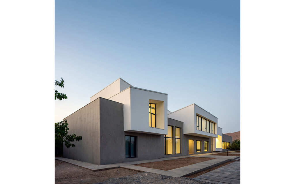
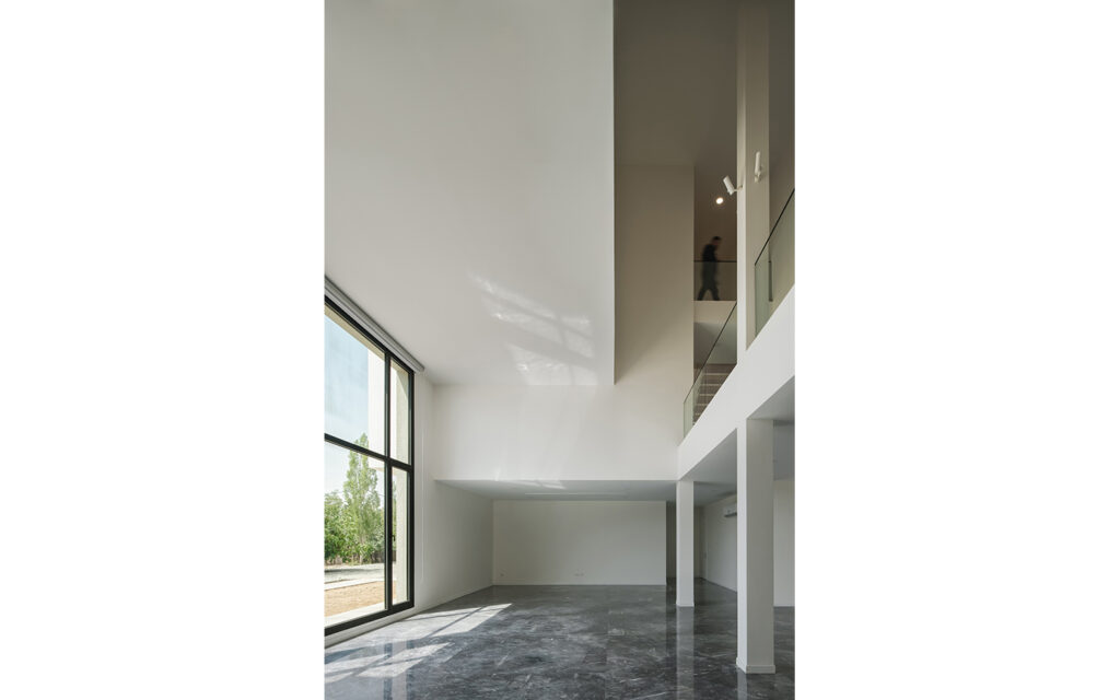
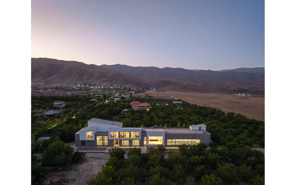
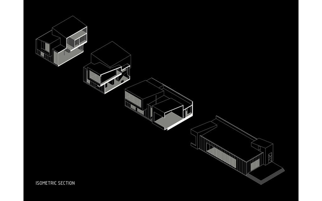
This project involved expanding an old villa near Tehran, used for weekend family gatherings especially when the air got polluted in the winter. Originally, it was a 12×12 meter house with three bedrooms, which was insufficient to accommodate a large family in need of additional rooms. The design process began by studying the relationship between the rooms and the common spaces of the house. As we explored different design alternatives, we decided to give each room a distinct, independent identity, reflecting the primary reason for the expansion. This idea of independence became a key feature, shaping the building’s exterior form and making the rooms visible and legible in the overall structure.
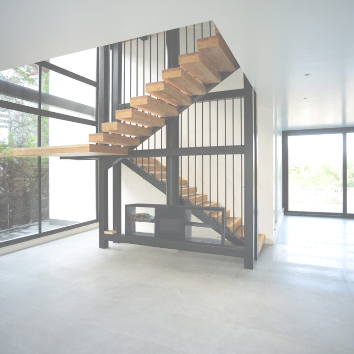
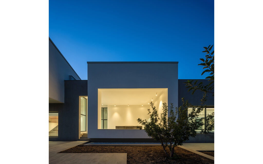
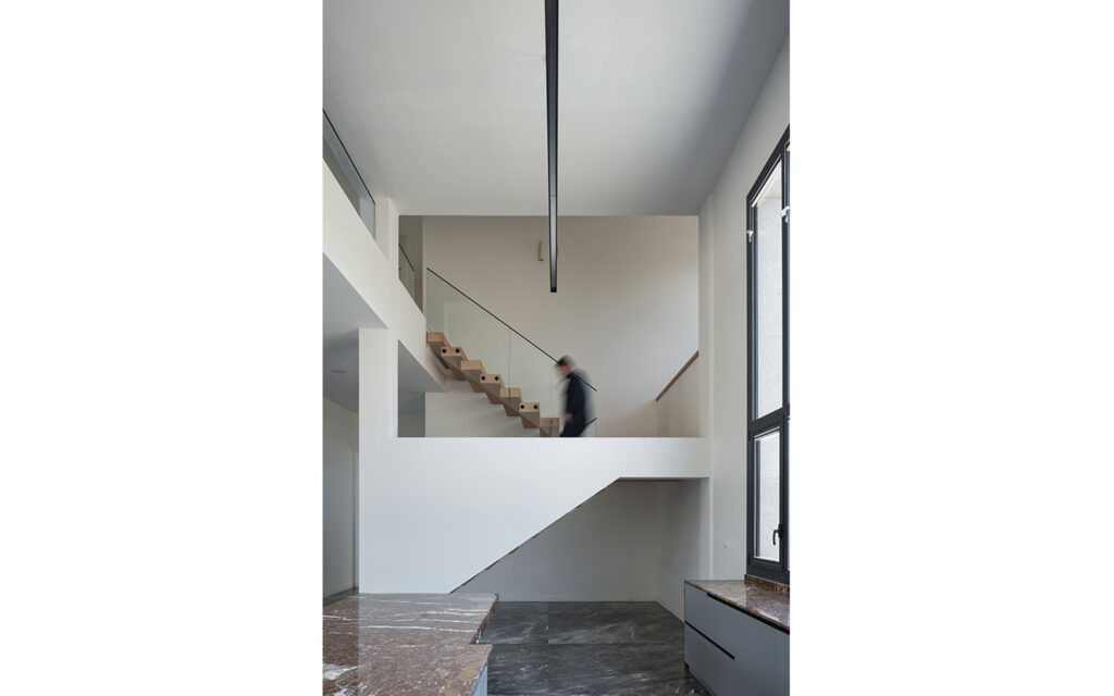
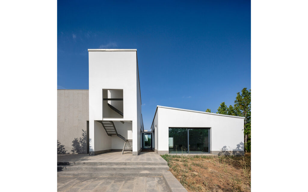
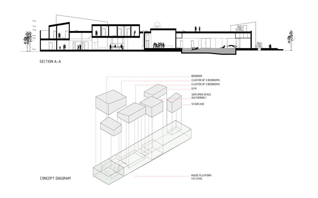
As the concept developed, this approach of giving distinct forms was applied not only to the bedrooms but also to other secondary spaces within the building. For example, a semi-open space was introduced at the center of the villa for gatherings throughout the seasons, as well as a staircase leading to the roof and an exercise area.
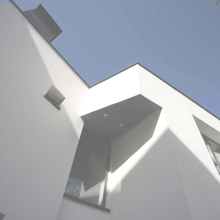
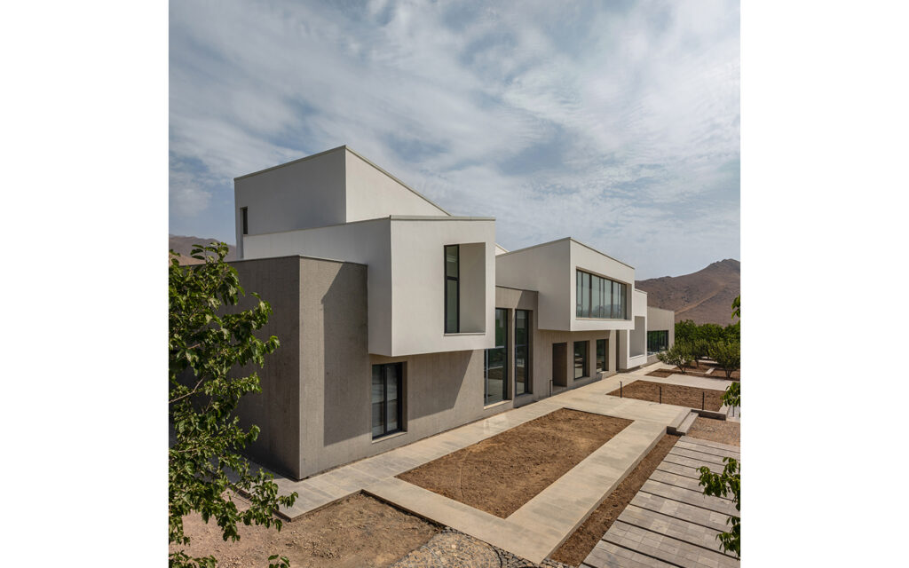
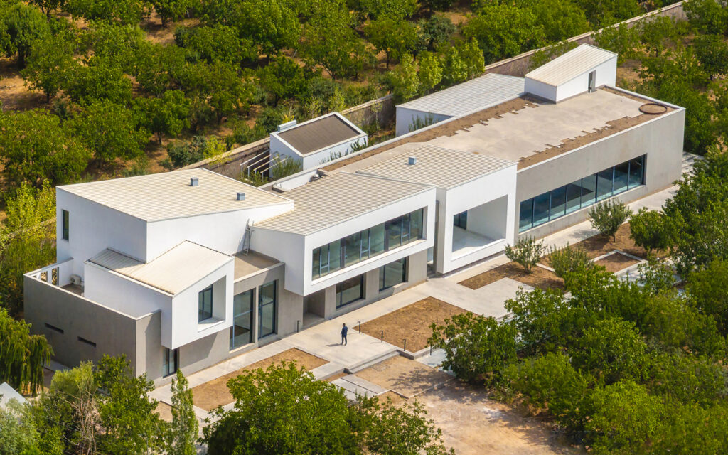
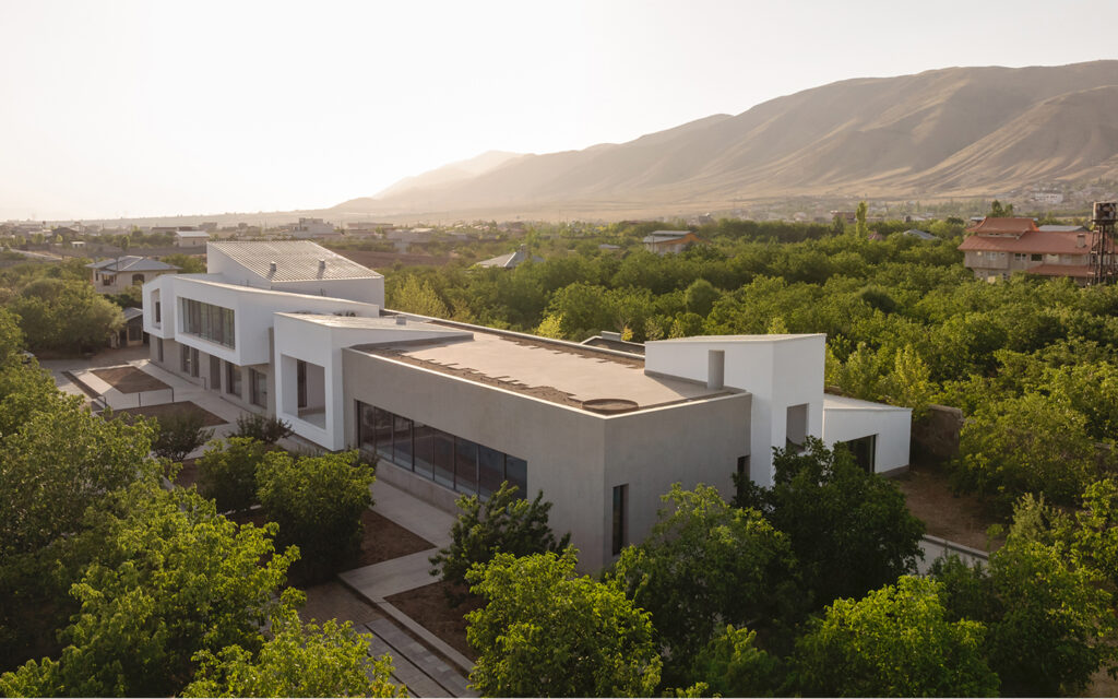
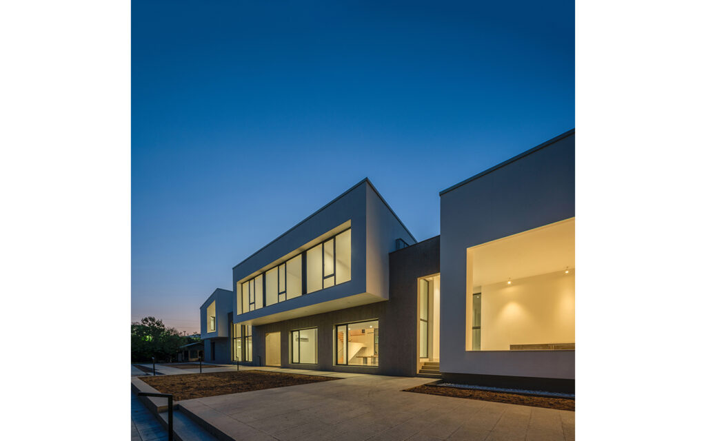
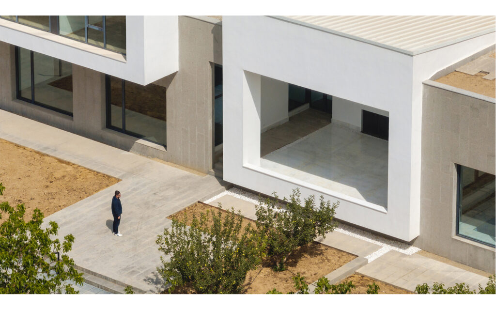
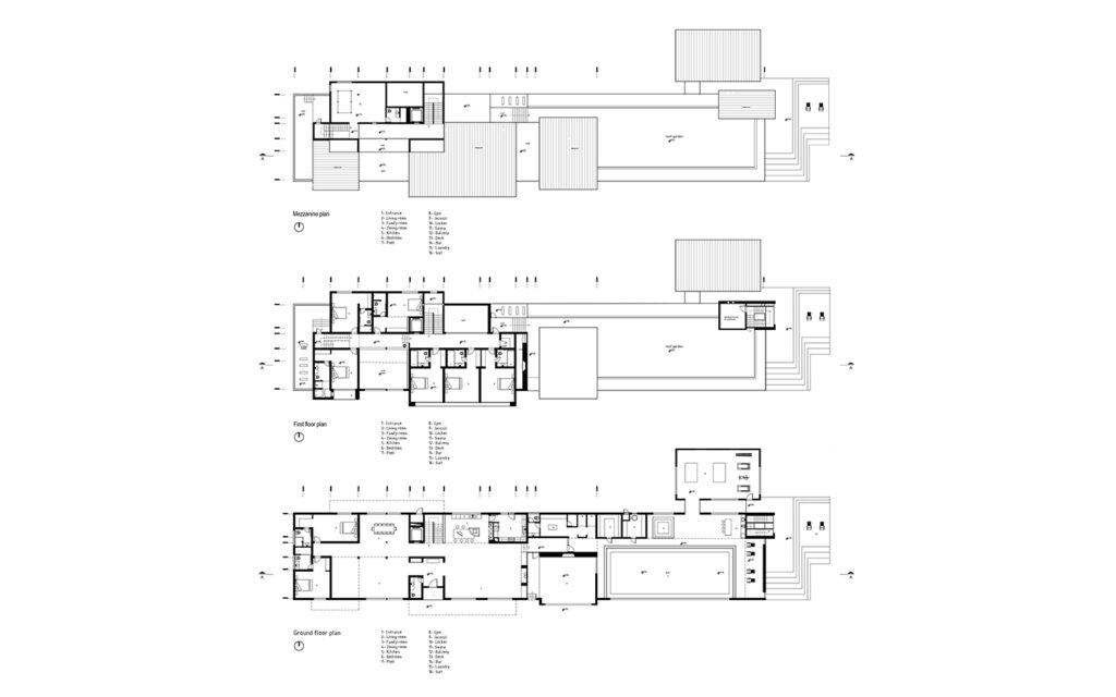
The expansion extended the house eastward, increasing its length from 12 meters to 70 meters, with a height of 6.5 meters. Our design strategy transformed the project into a simple gray platform made of granite, with independent, distinct white sloped boxes placed on it. These are clearly identifiable and recognizable in the building’s exterior form. The spatial units were carefully arranged on the granite platform (which serves as the common area) in line with our design intentions.
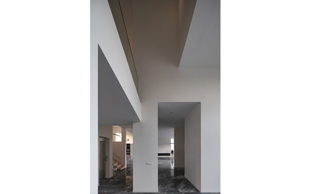
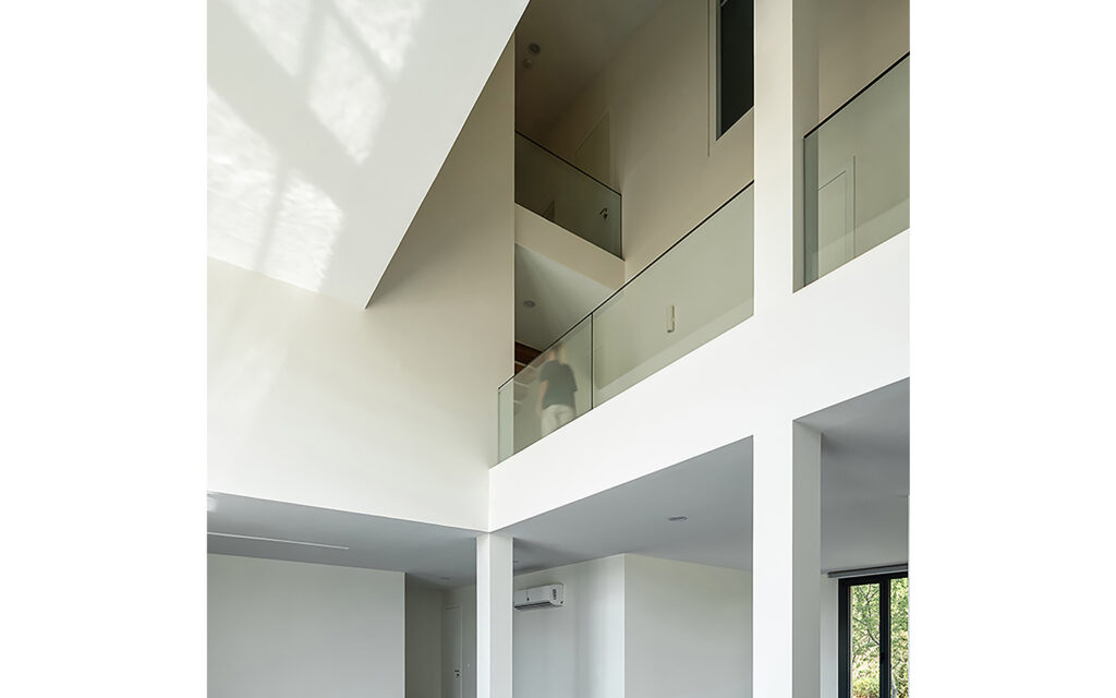
The swimming pool with 18 meter long window, and the building’s public spaces were all situated on the main platform, while the rooms, located on the first floor, were grouped into two sets of three rooms, along with a separate main bedroom. Both the rooms and other secondary spaces were designed as white spatial boxes with sloped roofs. The negative spaces between these volumes, sitting on the gray granite platform, create internal voids and contribute to a sense of openness within the building. Two long corridors—one on the ground floor and another on the first—run through the spatial boxes, serving as linear connectors between different parts of the house.
Design in Details
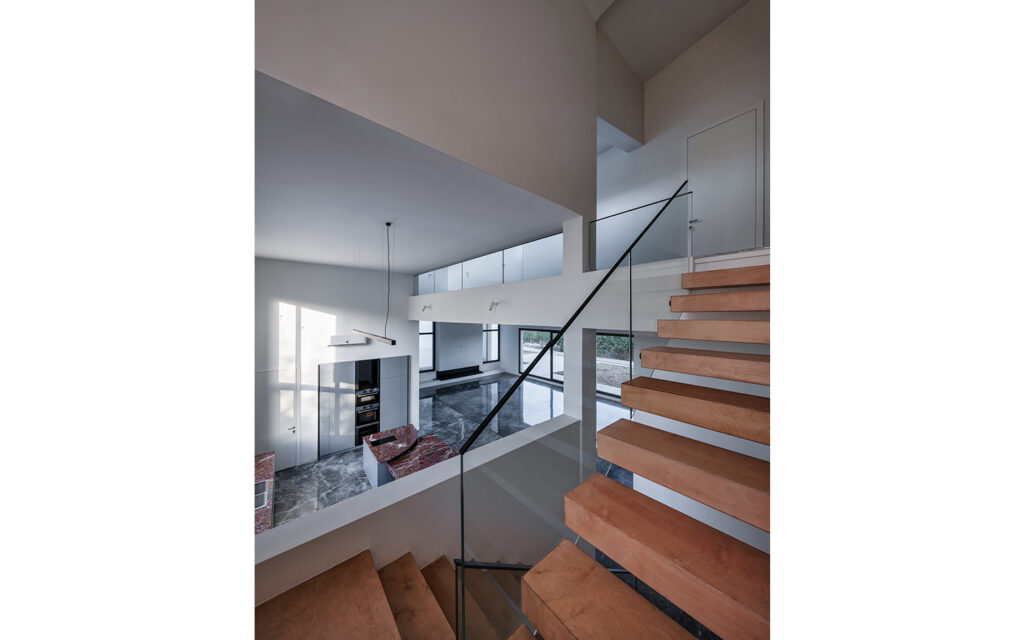
In design, we bring characteristics of the natural world into built spaces, such as water, greenery, and natural light, or elements like wood and stone. Encouraging the use of natural systems and processes in design allows for exposure to nature, and in turn, these design approaches improve health and wellbeing. There are a number of possible benefits, including reduced heart rate variability and pulse rates, decreased blood pressure, and increased activity in our nervous systems, to name a few.
Over time, our connections to the natural world diverged in parallel with technological developments. Advances in the 19th and 20th centuries fundamentally changed how people interact with nature. Sheltered from the elements, we spent more and more time indoors. Today, the majority of people spend almost 80-90% of their time indoors, moving between their homes and workplaces. As interior designers embrace biophilia.
[30m2]
bedroom
[22m2]
bathroom
[28m2]
workspace
[15m2]
kitchen area
Incredible Result
Establishing multi-sensory experiences, we can design interiors that resonate across ages and demographics. These rooms and spaces connects us to nature as a proven way to inspire us, boost our productivity, and create greater well-being. Beyond these benefits, by reducing stress and enhancing creativity, we can also expedite healing. In our increasingly urbanized cities, biophilia advocates a more humanistic approach to design. The result is biophilic interiors that celebrate how we live, work and learn with nature.


